Two days after upload, your retention graph (the share of viewers still watching, second by second) falls off a cliff. Then something jumps past 100 percent.
I checked YouTube's own Help pages and API docs, creator posts on Reddit and X, and public replay curves I pulled for four videos on 9 October 2026.
By the end you can read each part and pick one edit for your next upload.
Quick answer
- YouTube marks four key moments on the retention graph: Intro (the share still watching after 30 seconds), Top moments, Spikes and Dips, on videos of at least 60 seconds with 100 views.
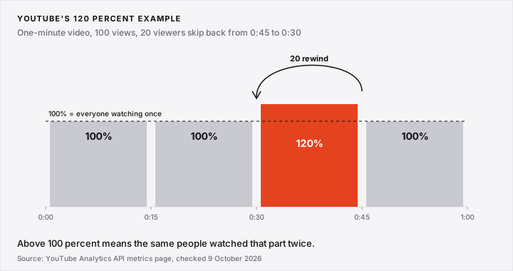
- A spike above 100 percent means rewatching. In YouTube's API example, 20 of 100 viewers skip back from 0:45 to 0:30, so that quarter reads 120 percent.
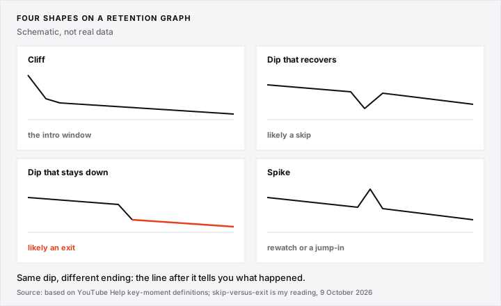
- YouTube's Dips lump skips and exits together. My reading, not YouTube's: a dip that recovers is more likely a skip, and one that stays down more likely an exit.
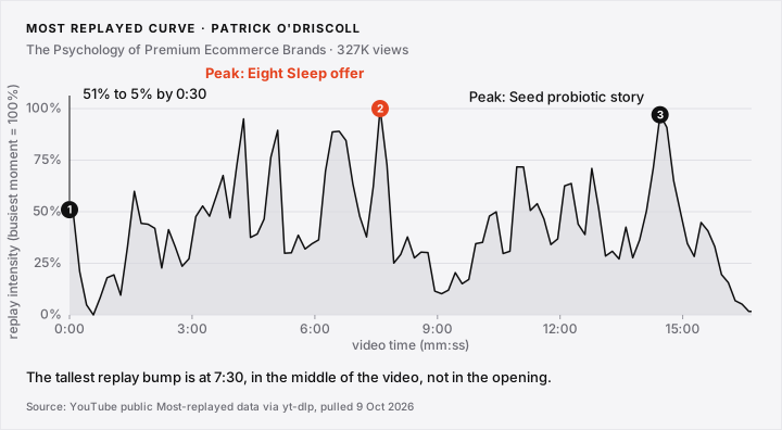
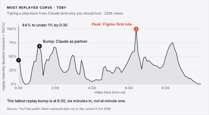
- In two of four public Most replayed curves I pulled on 9 October 2026, the busiest moment sat well after the intro: 7:30 on a 16:41 video, 6:20 on a 9:55 one.
- YouTube publishes no "good" retention number. It compares a video with your 10 latest videos of similar length.
Check your own video: paste the link in the free outlier checker. It shows the maths and takes a second.
- YouTube's Key Moments for Audience Retention: Intro, Top Moments, Spikes and Dips
- A Retention Graph Spike Above 100 Percent Means Viewers Rewatched
- YouTube Retention Dip Meaning: A Dip That Recovers Is Not a Dip That Stays Down
- The Opening Is the Steepest Drop on Most Retention Graphs
- Real Most Replayed Curves Show Where the Best Moment of a Video Sits
- Read the Retention Graph's Shape, Not Its Percentage
- Conclusion (What I Would Do)
- FAQ: Reading A YouTube Retention Graph
YouTube's Key Moments for Audience Retention: Intro, Top Moments, Spikes and Dips
YouTube's key moments for audience retention are four labels on your retention graph: Intro, Top moments, Spikes and Dips. They need a video of at least 60 seconds and 100 views, per YouTube Help.
| Label | What YouTube says | What it means for you |
|---|---|---|
| Intro | "what percentage of your audience still watched your video after the first 30 seconds" | How many people your opening kept |
| Top moments | "moments in your video where almost no one dropped off" | Flat stretches where nobody left |
| Spikes | "moments in your video that were rewatched or shared" | People went back, or jumped to it |
| Dips | moments "either skipped" or where viewers "stopped watching your video completely" | People jumped past it, or left |
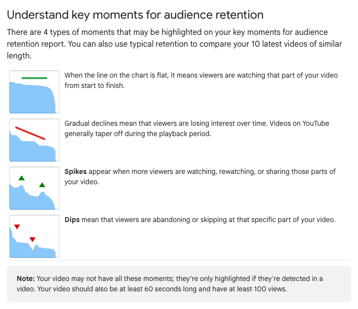
What the Flat Line and the Grey Band Mean
- A flat line means viewers "are watching that part of your video from start to finish". A gradual decline is normal, because videos "generally taper off".
- The grey band is typical retention: your 10 latest videos of similar length. SEE MORE compares you with all similar-length videos on YouTube.
- In October 2020 YouTube called flat stretches "Continuous Segments", per Tubefilter.
I think your own grey band is the fairest comparison.
A Retention Graph Spike Above 100 Percent Means Viewers Rewatched
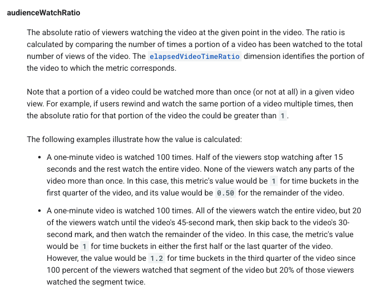
A retention graph spike above 100 percent means some viewers watched that moment more than once. YouTube's Analytics API says the value can be "greater than 1" when users rewind and rewatch.
That value is plays of a moment divided by total views.
YouTube's Own 120 Percent Example, Step by Step
- In YouTube's example, a one-minute video gets 100 views, all watched to the end.
- 20 of them reach 0:45, skip back to 0:30 and watch the rest.
- The first half and the last quarter were watched 100 times each: 100 ÷ 100 = 1.0, drawn as 100 percent.
- The third quarter, 0:30 to 0:45, was watched 120 times: 120 ÷ 100 = 1.2, drawn as 120 percent.
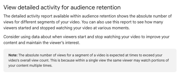
Help says segment views are "expected at times to exceed" a video's total views.
A Spike Is Not Always Good News
- Viewers rewatched or shared it, per Help.
- "Your content isn't clear and your audience had to rewatch a section", also per Help.
- "someone sent out a timestamped link to that moment", per Tubefilter's report on the 2020 launch.
u/VidiotOverride19 saw 205 percent:
"at the 2:17 mark, the retention goes from the 33% line, and jumps up to 205%! I honestly didn't know that it could go higher than 100%"
On a thread about a 300 percent spike, u/minimumcool replied:
"either that section is great or its confusing or its a trainwreck."
YouTube Retention Dip Meaning: A Dip That Recovers Is Not a Dip That Stays Down
A YouTube retention dip means viewers skipped that part or stopped watching, and the Help page does not say which. A line that climbs back usually means a skip; one that stays lower usually means an exit.
That reading is mine, not YouTube's wording.
Two Dips, Two Different Fixes
- Dip that recovers (skip): viewers jumped past a slow part and came back. Tighten it, move it later, or add a chapter.
- Dip that stays down (exit): viewers left for good. Fix the setup before the drop that made leaving feel safe.
YouTube Creators calls the graph "literally a cheat sheet" and says to trim lulls in your next edit.
Check the Detailed Activity Report
The detailed activity report is the Studio view that counts viewers who started and stopped watching at each moment. I think many stops at a dip means an exit, and many starts further on means a skip.
Watch the Seconds Before the Drop
Retti, which sells a retention tool, says the cause "sits upstream": check the 20 seconds before. u/theideaguy_ put it this way:
"The dip isn't caused by whatever is playing at the dip. It's caused by what came before it."
The Opening Is the Steepest Drop on Most Retention Graphs
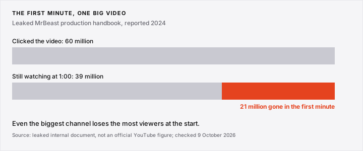
The steepest drop on most retention graphs is in the opening. Retti puts it inside the first tenth of runtime, and YouTube's Intro key moment measures the 30-second mark.
The leaked MrBeast handbook says "the first minute has the most loss": 21 million of 60 million clicks gone by 1:00.
Why the Opening Is the Highest-Leverage Edit
- Every viewer sees the opening, so a fix there reaches the most people.
- YouTube says a high Intro could mean the first 30 seconds "matched the viewer's expectation of the video's thumbnail and title".
- For a weak Intro it suggests changing the title, thumbnail or first 30 seconds: our thumbnail swap evidence.
- u/superazure81 put it bluntly: "The ones who stay - keep watching. So the content isn't the problem but the start of the video."
The 30-second mark is YouTube's Intro window, not a rule for counting a view. Rene Ritchie says a view never needed 30 seconds.
Real Most Replayed Curves Show Where the Best Moment of a Video Sits
The Most replayed graph is the grey bump curve above the progress bar on any public YouTube video, showing which moments were replayed most. YouTube launched it on 18 May 2022.
It is not your Studio retention graph. One engineer who reverse-engineered it reports each video is scaled so its busiest moment is 100 percent, so curves cannot be compared in height across videos.
What the Curves Show on Four Outlier Videos
- Patrick O'Driscoll: about 327,000 views on 9 October 2026. Tallest bump 7:30 of 16:41, the Eight Sleep offer. Replay intensity falls from 51 to 5 percent of the peak by 0:30.
- Toby: about 222,700 views on 9 October 2026. Tallest bump 6:20 of 9:55, his Figma-first rule. Replay intensity falls from 44 to under 1 percent of the peak by 0:30.
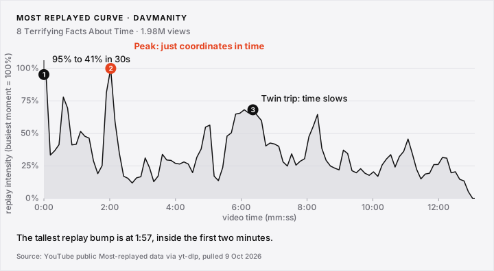
- Davmanity: about 1.98 million views on 9 October 2026. Tallest bump 1:57 of 13:06, the "just coordinates in time" line.
- Fredda: 991,885 views on 9 October 2026. The curve peaks at 13:38 of 20:39.
What the Most Replayed Curve Cannot Tell You
- It counts replays, not who left.
- It is scaled per video, so 100 percent on one is not 100 percent on another.
- Small dips beside sharp peaks can be drawing artefacts, one engineer reports.
Find outliers for free to pick curves worth pulling.
Our own YouTube outlier breakdown takes one outlier video apart: packaging, opening and numbers. Free, one email. Subscribe here.
Read the Retention Graph's Shape, Not Its Percentage
On a retention graph, the shape tells you more than the percentage. YouTube's own advice: if Top moments come late, introduce the compelling content earlier, because audiences shrink. So push the flat part left.
Why Was the Best Moment at Minute Six, Not Minute One
- Find the timestamp of your best moment.
- Ask why a viewer had to wait that long for it.
- Move a piece of it, or a promise of it, into the opening.
- Keep the payoff where it is if the story needs it.
Toby's busiest replay moment sits at 6:20, minute six, not minute one.
A Front-Loaded Example: Davmanity
In our Davmanity breakdown we found a front-loaded build, and its curve fits:
- It starts on fact one at 0:00, no greeting or branding, with 19 cuts in the first 21 seconds.
- Its eight facts land about every 98 seconds.
- Its busiest replayed moment is 1:57, inside the first sixth of 13:06, and the first segment reads 95 percent of that peak.
That is the replay curve, not his retention.
Why the Percentage Misleads
- Seth Fowler, who builds the tool Retti, writes that low retention on a cold audience is "the reach working, not your video failing".
- SAM OCEAN reports a video whose retention sat below its grey band that reached 1.3 million views (self-reported).
So compare against your own grey band, not a number from a blog.
Conclusion (What I Would Do)
Here is what I would do this week on your last three long videos.
- Wait two days after upload; the data takes 1 to 2 days to process.
- Read the four labels first, then the shape.
- For each dip, check whether the line recovers, and watch the 20 seconds before it.
- Treat any spike above 100 percent as a rewatch to explain, not a trophy.
- Ask why your best moment came late, like Toby's at 6:20, and move it earlier.
Then change the first minute of your next upload.
FAQ: Reading A YouTube Retention Graph
What is viewer retention on YouTube?
Viewer retention is the share of viewers still watching at each moment of a video, drawn as the retention graph in Studio. YouTube's Intro label is the share left after 30 seconds.
How do I check audience retention on YouTube?
In Studio, open the video, then Analytics, then Engagement. Key moments need a video of 60 seconds and 100 views, per YouTube Help.
What does a typical YouTube retention graph look like?
A steep fall in the opening, then a gentle downward slope. YouTube's grey band is your own 10 latest similar-length videos. Vendor averages circulate, but the report most cite no longer loads (checked 9 October 2026).
Why does my retention graph look wrong on a new video?
The data typically takes 1 to 2 days to process. On a low-view video, one creator says, "even 1-2 people clicking off can instantly crash your retention".
Does a YouTube view only count after 30 seconds?
No. Rene Ritchie says it "hasn't been 30 seconds". Since 24 August 2026 views count from the first frame. Per YouTube, retention is calculated as before, on engaged views: clicking to watch or watching past the first seconds.