Toby’s channel used to get about 228 views a video, but “Taking a step back from Claude (and why you should too)” got 115,963 views when I measured it on 21 August 2026. That is roughly 508 times more.
It has kept climbing since, past 157,241 views by 5 September 2026.
So let’s look at the packaging, the opening and the rest of the edit, and see if there are things other creators can replicate for better views.
1. How the Video Performed
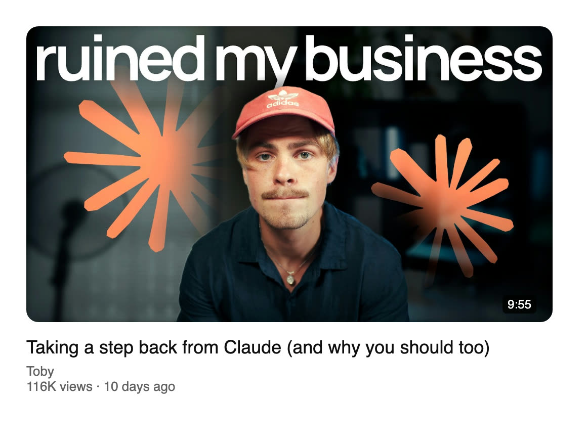
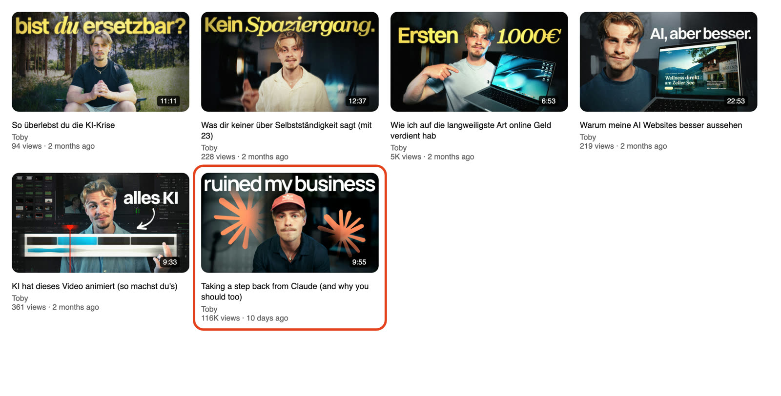
The video is 9:55 long and had 681 comments when this was checked. It had 115,963 views on that day, on a channel that usually got about 228 views per video before this one.
Before this, Toby made his videos in German. Between 28 May and 21 June 2026, his five earlier uploads were:
- “So überlebst du die KI-Krise” with 94 views
- “Was dir keiner über Selbstständigkeit sagt (mit 23)” with 228 views
- “Wie ich auf die langweiligste Art online Geld verdient hab” with 4,513 views
- “Warum meine AI Websites besser aussehen” with 219 views
- “KI hat dieses Video animiert (so machst du's)” with 361 views
Then there was a 51-day gap. On 11 August, Toby uploaded his first video in English.
So AI as a topic alone did not make every upload work. The earlier AI website video got 219 views, while the one before this got 361.
According to the comments, 50.8% agree and tell their own version of the same story. Also, 19.5% push back and call it clickbait or a skill issue, 11% give advice, and 6.2% praise the video.
This is the only comment that says how someone found the video:
This video just got recommended to me by Youtube. I hope your channel keeps growing
So this leans towards YouTube recommendations doing the distribution.
My verdict is that there is both strategy and luck here. This was his first English video, while all earlier ones were German. The thumbnail text is now in English too, which may have helped it travel, and it landed when Claude was getting a lot of traction and attention.
2. The AI News Wave Behind It
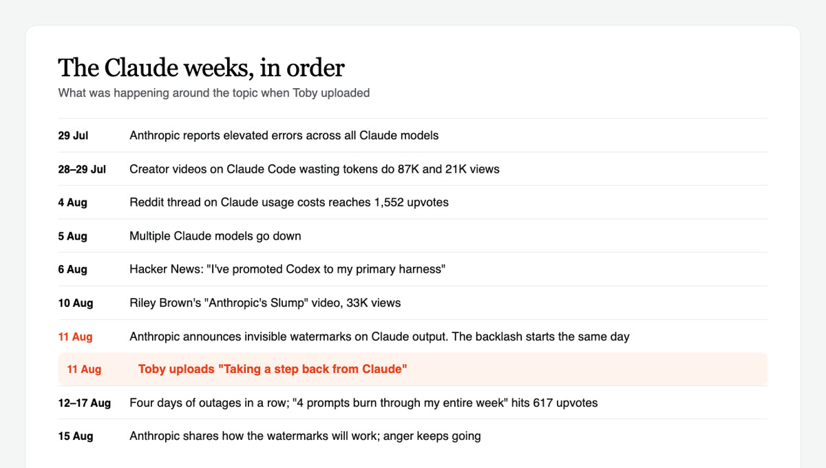
Claude was already becoming a topic before Toby uploaded.
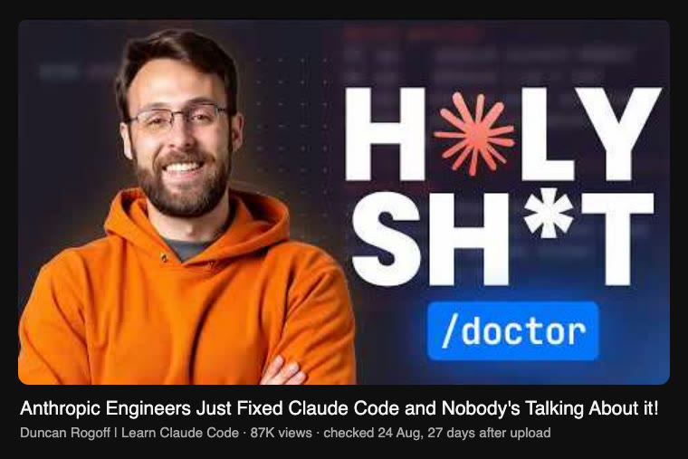
- On 28 July, a Claude Code creator posted about context waste costing people “tokens, speed, and money”. The video got 87,421 views on a channel with 84.5K subscribers.
On 29 July, Anthropic reported elevated errors across all Claude models.
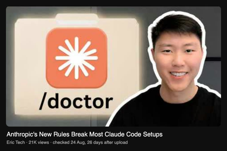
Also on 29 July, another YouTube creator said new Claude Code rules were breaking setups and wasting tokens. That video got 21,313 views on a 74.8K-subscriber channel.
On 4 August, a Reddit thread got 1,552 upvotes from a person saying, “I have usage credits off.” This is a user report, not proof of a billing problem, but it shows people were worried about Claude costs.
On 5 August, multiple Claude models went down.
On 6 August, a Hacker News thread got 46 points and 66 comments. One person said, “I’ve promoted Codex to my primary harness.”
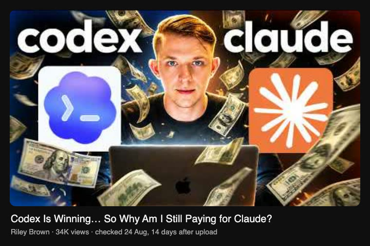
On 10 August, Riley Brown posted a video calling this period “Anthropic’s Slump”. It got 33,416 views on a channel with 276K subscribers, and compared Claude with Codex and cheaper alternatives.
On 11 August, Anthropic said it would watermark text generated by its models to comply with the EU AI Act. Forbes covered the same day, saying the internet was not happy, while Fortune framed it as the industry trying to police AI slop. Toby uploaded on the same day.
On 15 August, Anthropic shared more details about how the new watermarks would work. The anger came especially from coders worried a signature in generated output would make it worse, and from people who only used Claude to proofread their own writing. Some people said on X that they were cancelling subscriptions.
On 17 August, a Reddit thread got 617 upvotes and said, “4 prompts burn through my entire week.”
On 18 August, another Reddit thread got 126 upvotes and said, “Nothing except a claude status updates.”
Toby uploaded after the news started, which looks like a read of the mood. So I think there was strategy in the timing, though we cannot see his traffic sources.
But the biggest wave came after he uploaded. The outages, limits anger and watermark backlash peaked in the exact week his video was available, so that likely lifted it further.
3. Did Toby's Other Platforms Grow This Video?
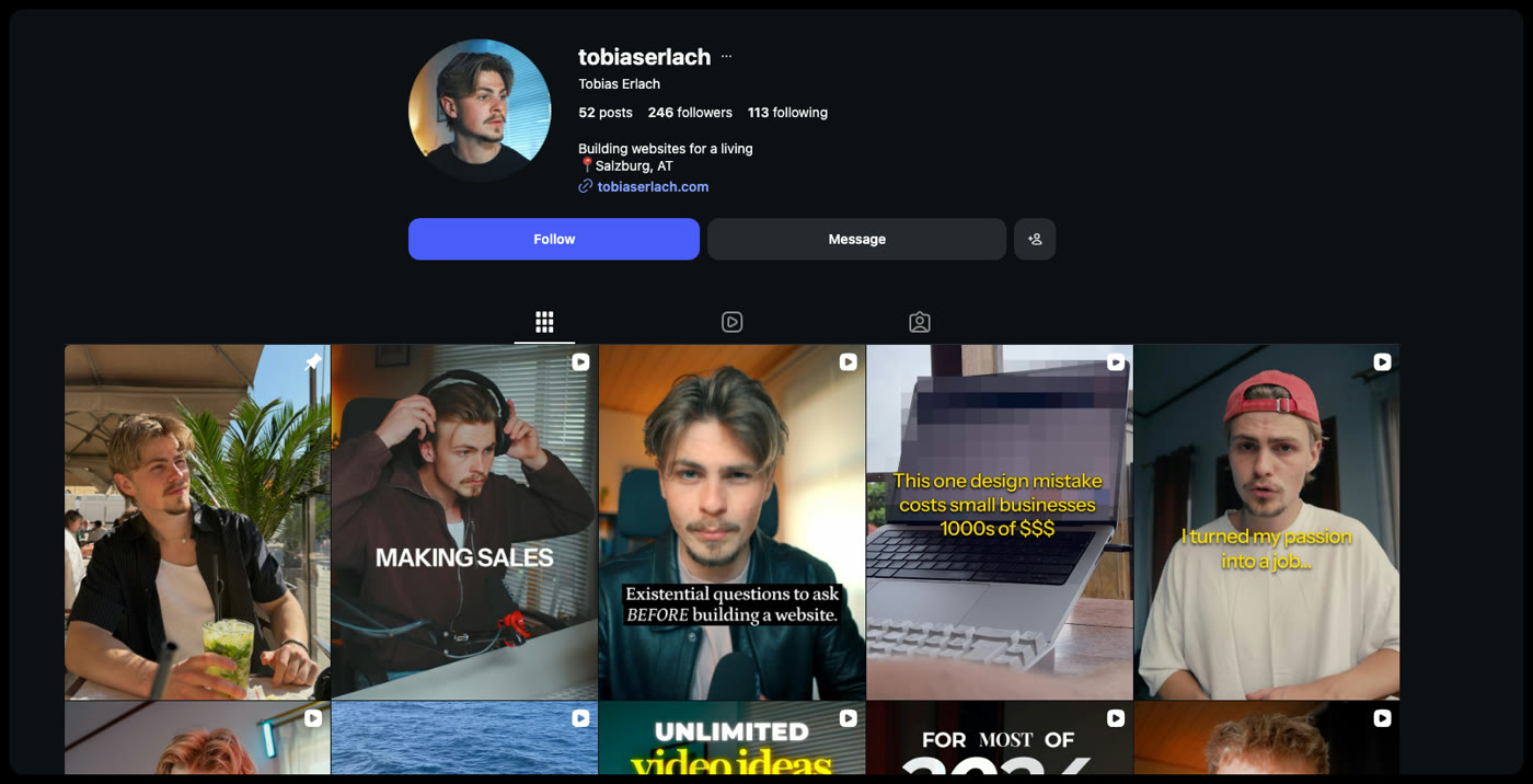
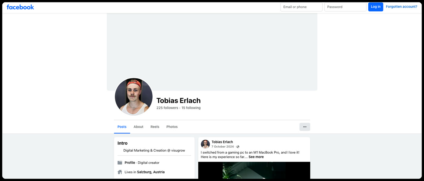
Toby has a few places people can find him, but the numbers are small.
- His Instagram account has 52 posts, 246 followers and follows 113 people. Its bio says, “Building websites for a living”, and links to tobiaserlach.com.
- His Facebook page has 225 followers and follows 15 people. Its intro says, “Digital Marketing & Creation @ visugrow”, and links to creatortoby.com.
- He runs Studio Erlach, has a newsletter, a consulting page, and an early-access product called Design Mind. But the newsletter and product user counts were not visible.
I could not find his profiles on any other platform, like TikTok, X, LinkedIn, Threads, or a Discord or any other community.
A couple of hundred followers cannot make the 115,963 views it had on 21 August 2026. So the traffic did not come from his own audiences, it came from YouTube itself.
4. The Thumbnail Breakdown
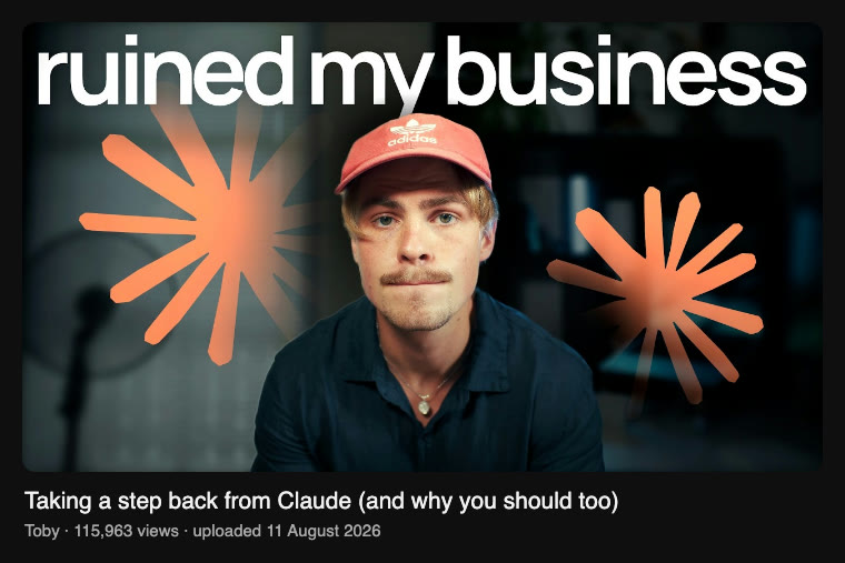
The thumbnail is very simple. Toby has a flat, tired expression, direct eye contact, a dark office background, giant white text saying “ruined my business”, and orange starburst shapes around his face.
Colin and Samir say, “the thumbnail has to stop your scroll,” and say a big face and symmetry work well for them in their thumbnail breakdown. This thumbnail follows that well because the face is centred, the orange shapes mirror each other, and the white and orange stand out against charcoal black.
They also say a thumbnail should “beg a question or suggest transformation.” This one creates a very direct question: what did Claude do to this person’s business?
Paddy Galloway says a thumbnail is mostly “the psychology of the click” and less about design in this video. I think that is exactly what is happening here, because “ruined my business” is not useful information by itself. It is a problem you want explained.
I think the timing made the click even easier. It went up on the day the Claude watermark news broke, while people were already angry about outages and limits, so the claim that an AI tool had ruined someone's business felt very relevant that week.
The thumbnail follows the short-text rule too. Film Booth says to simplify the message to around four words so it works when displayed small in this video, and Toby uses three.
But it breaks a couple of common rules. The text is not on the left, and the face is not shocked or exaggerated.
Still, that may help. MrBeast said, “I closed my mouth on all my thumbnails and the watch time went up on every video lol,” as reported by IGN. Tyler Fleischman also says a subtle expression can feel authentic in his thumbnail analysis.
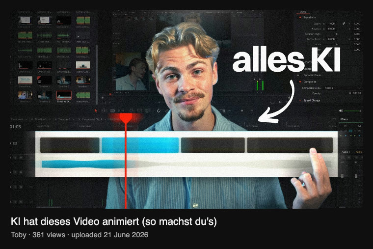
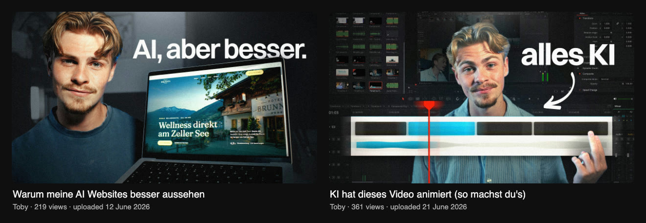
The thumbnail before this used a busy editing software screen behind the face and the text “alles KI”. I think that means something like “everything AI”, though I do not speak German. In my opinion, it becomes visual noise when small because the face, text, arrow, and interface are all asking for attention.
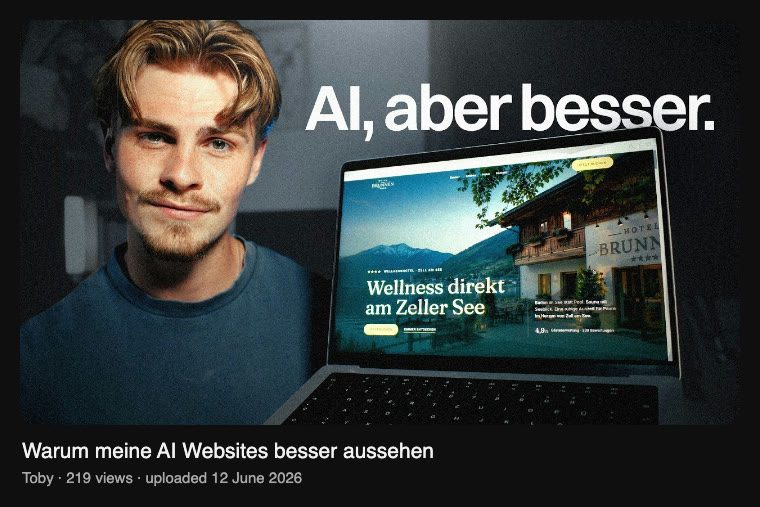
The earlier website thumbnail is cleaner, with a laptop and the text “AI, aber besser”. I think that means “AI, but better”. But it looks like a normal AI tool showcase, and it does not have the strange negative claim that makes you stop.
Nobody found evidence that the Adidas logo on Toby’s cap helps thumbnails. It looks incidental, which means it is just part of what he wore.
My verdict is that the thumbnail did a major part of the work. It is clean, readable, and unusual because it sells an honest confession instead of an excited AI promise.
5. The Title Breakdown

The title uses sentence case, no capital-letter shouting, no number, brackets, the Claude brand name, and a personal first-person angle.
I think the Claude name helps because it tells viewers straight away who the video is for.
Ali Abdaal says, “Use language your viewers can understand at a glance,” in his YouTube guide. This title follows that because everyone who knows Claude understands “taking a step back”.
Jake Thomas says, “The most powerful emotion when it comes to getting people to click on your YouTube title is curiosity,” in Creator Hooks’ title tests. The title gives the action, but it does not give the reason, so the viewer has to click to get it.
It also uses negative framing without saying Claude is bad. Jake Thomas says, “Negativity does a great job of getting people's attention,” and this title quietly says a popular tool may be causing a problem.
But it breaks Ali Abdaal’s mobile guideline by one character. He says titles beyond 54 characters may not show fully on some mobile devices, and this title has 55.
Also, it has no number or proof point. That means the title is clear but slightly vague, so the thumbnail has to carry the specific problem.
The bracket line helps too. Scott Nelson says, “using brackets in the title boosts my click-through rate,” in this Databox roundup.
Nobody found a credible source saying that sentence case itself improves click-through rate. Also, nobody found proof that simply naming a brand improves click-through rate, although Claude makes the audience and topic clear.
My verdict is that the title and thumbnail work as one pitch. The title says what Toby is doing, and the thumbnail says why.
6. The Intro Breakdown (First 93 Seconds)
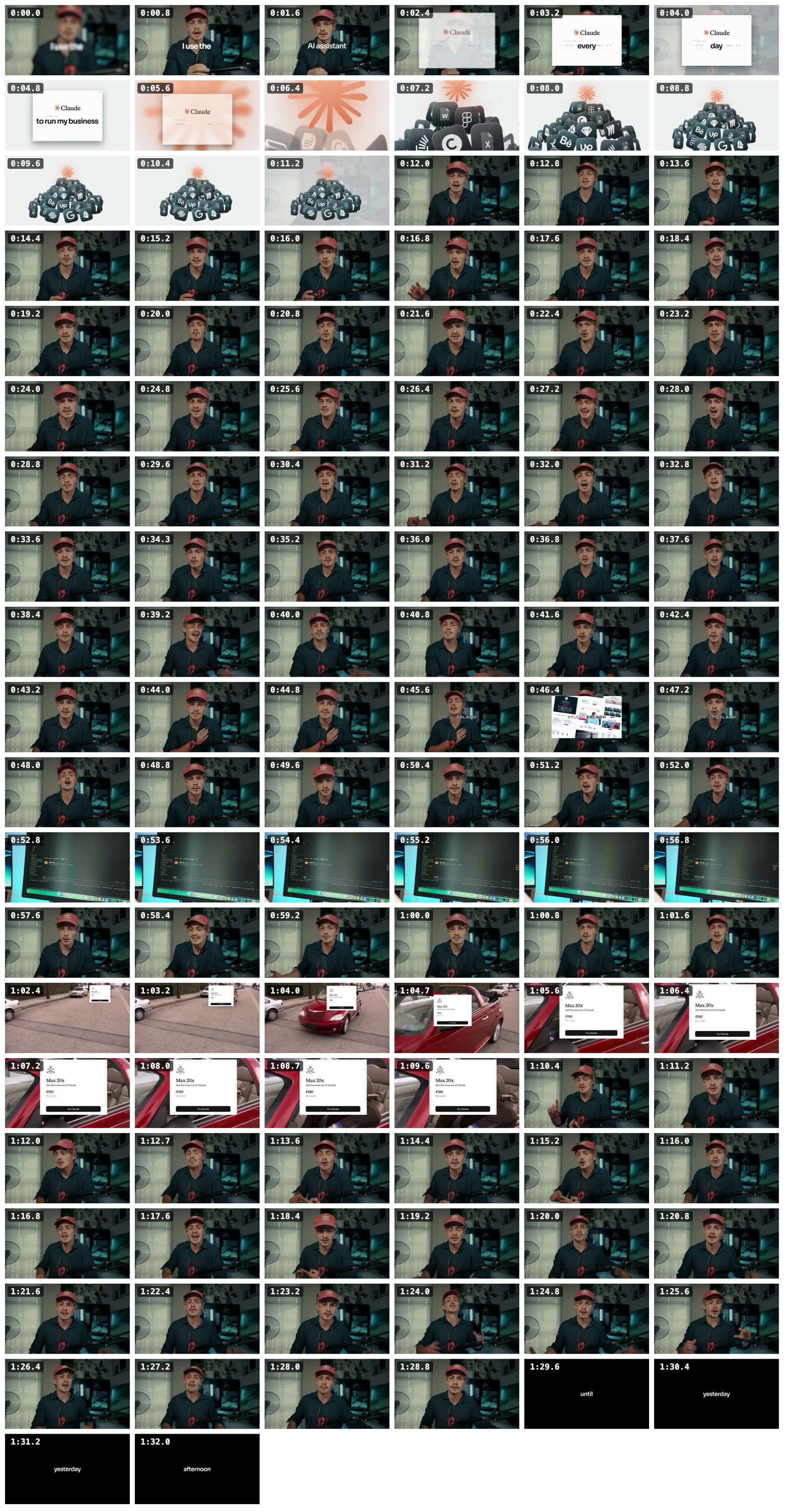
The intro has 16 shots. Toby’s face is on screen for 67% of it, b-roll, which is extra footage used to break up the main camera shot, takes 33%, and there are 4 text cards.
There are captions in bold white text, usually one to three words at a time. There is also music, a Claude window graphic, app icons collapsing together, a screen recording, and a meme-style car clip.
The script is:
[0:00] “I use the AI assistant Claude every single day to run my business.”
[0:05] “It single-handedly replaced almost all the other tools that I was working with.”
[0:11] “Yet, I have decided to take a step back from Claude as it started to impact my business in a negative way.”
[0:17] “And in this video, I want to tell you how things started turning for the worse and why you should consider doing the same thing.”
[0:33] “But before we dive too deep into this, I want to give you a quick overview of who I am.”
[0:43] “I'm Toby, Tobias, and I run a web design agency located in the heart of Europe in Salzburg, Austria.”
[0:55] “We started implementing it everywhere, so much that I recently upgraded to their most expensive plan.”
[1:08] “It's Britney.”
[1:17] "I'm pretty sure at a certain point it felt like cheating, like an unfair advantage."
[1:28] “Until yesterday afternoon.”
Colin and Samir say the first job of an intro is to “immediately confirm” that this is the video the viewer clicked in their intro checklist. Toby does that at 0:11, when he says Claude started affecting his business negatively.
They also say to create a new unclosed loop, which means a question the video has not answered yet. Toby does this best at 1:28 with “Until yesterday afternoon,” because now you want to know what happened.
MrBeast says, “The first minute of each video is the most important minute,” in his production handbook. Paddy Galloway also says the strongest part should come in the first 30 to 60 seconds in this Editing Podcast episode.
Toby partly follows this. The first frames confirm Claude is central to his business, the thumbnail claim comes early, and the app graphics make the point easier to understand.
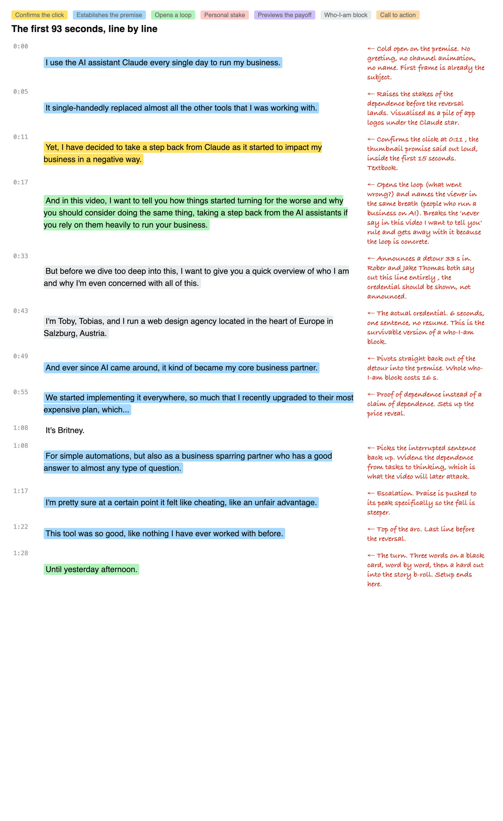
But there is a problem at 0:33. He stops the story to explain who he is, and the actual incident does not begin until 1:29.
George Blackman says the hook should have only “critical information” in this video. He also says, “any more than” one credibility statement and “you're cooked,” so Toby’s business and location introduction is risky.
The intro also has a long talking-head stretch from 0:11 to 0:46. Creator Talk says a shot change every one to three seconds can keep people locked in because the brain wants novelty, in this video.
But Toby uses an off-framework move that I think works. At 1:03, he shows the Claude plan price over a red PT Cruiser clip, then says “It’s Britney” at 1:08.
Nobody found a framework source that says this specific verbal joke works. But one YouTube education channel says b-roll breaks the monotony of the main camera shot in this video, and that is what the meme does here.
The intro before this video is about AI animating the video, and its thumbnail already makes that clear. The website video before that opens around an AI website result, so both are more tool-focused and less personal.
My verdict is that the intro breaks a lot of strict framework rules, but its best move is very good. Toby turns a broad Claude opinion into a specific personal event, then stops just before telling us what it was.
7. The Rest of the Video
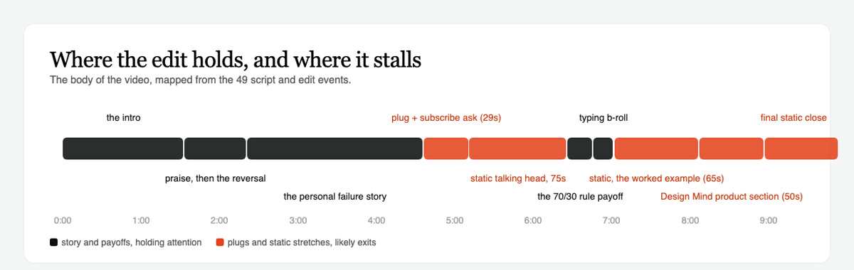
The body keeps opening loops, which are questions the viewer still wants answered. At 2:21, Toby moves into the personal failure story, at 3:29 he explains why AI became the easy option, and at 4:36 he asks what he will do about it.
He pays off the central idea at 6:26 with the 70/30 rule. That is Toby doing most of the thinking himself, then using Claude as support rather than letting it lead the work.
The video looks clean in the early section, with screen recordings, overhead desk b-roll, full-screen question cards, and dark talking-head shots. But the edit becomes much more static later.
There is a 74.7-second talking-head stretch beginning at 5:11. There is another 65-second static stretch beginning at 7:02, and a final static talking-head section near the end.
Film Booth says Shelby Church keeps storytelling and b-roll at the same pace throughout her video in this retention breakdown. Toby does the opposite, because his visual energy is high early and much lower once he starts explaining the solution.
The self-sponsor gag and subscribe ask come at 4:42. Then Design Mind gets a 50-second product section at 8:07.
MrBeast says, “BRAND DEALS ARE CONTENT,” in his production handbook. I think the earlier joke earns some attention because it is part of the tone, but the later product section is a downside because it comes after viewers have waited for the practical answer.
My verdict is that the story section is strong, but the back half gives people too many reasons to leave. The core point is useful, but it could have arrived earlier with more visual support.
8. The Expected Retention Graph
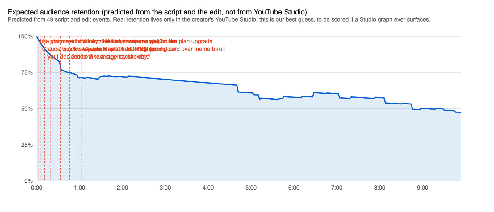
This is a predicted retention graph from the script and edit, not YouTube’s real graph. We do not have Toby’s actual YouTube retention graph.
I think the biggest hold is the first four minutes. Toby moves from Claude helps my business to the moment where he realises he is wasting time, and that is a clear personal story with rising stakes.
The biggest predicted drop is the self-sponsor and subscribe section at 4:42. It interrupts the open question about what Toby will actually change.
The next big drop is the static explanation from 5:11 to 6:26. The useful 70/30 rule comes at the end of that stretch, but some people may leave before they hear it.
The third big drop is the Design Mind product section at 8:07. It is long enough to feel like a detour after the viewer has already received the main answer.
My verdict is that the video probably held well because of its premise and personal story, not because every section was retention-optimised. The early part is very strong, while the later part is where the edit loses momentum.
I think this result came from both strategy and luck. In this case, the two are hard to separate.
I think this was a smart shift: his first English video after five German ones uses a thumbnail built around a personal confession, “ruined my business”, rather than a broad AI promise. The title and thumbnail make the same pitch, and the opening confirms it at 0:11; the packaging and video quality are clearly much stronger than in his older videos.
It went up on the same day as the Claude watermark news. The biggest wave of outages, limits anger and watermark backlash came after upload, lifting a video that was already there. He could not have planned that.
I would take this as a reminder to watch what your ideal audience is already discussing in your niche. Reddit, Quora and other communities where they spend time can reveal the worries, questions and language worth building a video around.
9. What You Can Take From This
If I were a small creator, I would copy the idea behind this thumbnail, not just its visual style. Pick a real problem, make the title explain the action, and make the thumbnail show the consequence.
Also, confirm the thumbnail promise early. Toby says he is stepping back from Claude at 0:11, so viewers do not feel misled.
But I would start the real story sooner. Keep the background brief, and do not save the strongest incident for after a long introduction.
If you already have an audience, I think you can take more personality risks. Toby’s flat expression, deadpan joke, and personal opinion work because they feel like a person talking, not a generic AI video.
Also, keep a close eye on what your ideal audience is discussing in your niche, on Reddit, Quora, and the communities where they spend time. I think that is where this video’s topic was already boiling.
But do not let plugs, subscribe asks, or static explanation take over the back half after you have built a strong opening. I would use a similar structure with a quicker turn into the story and a shorter product section.
Still, I would not copy everything that looked strategic. Fast cutting was not required here, the parenthetical title format also appeared on Toby’s low-view videos, the intro broke several framework rules, and the cap logo was probably just wardrobe rather than a branding move.
Finally, the retention graph and comments cannot prove where the views came from. I would treat this as a one-off until another upload tests the pattern.
My prediction is that Toby’s next upload lands between 2,000 and 30,000 views by 2026-10-31, or 30 days after his next upload, whichever is later.
10. The Replicable Parts, in One Table
I pulled out the parts I think another creator can actually try, but I would still treat them as hypotheses.
| What this video did | Who else says it works | How sure we are, and why |
|---|---|---|
| The thumbnail carries the consequence and the title carries the action, so the two halves only make sense together. | a YouTube education channel; Paddy Galloway | Medium. The split is clear and both sources back it, but there is no CTR or impressions data and this is one video. |
| It used a flat, tired, unimpressed face instead of a shocked one. | MrBeast (via IGN); Tyler Fleischman; a YouTube education channel | Medium. Named sources back the deadpan trend, but expression changed alongside other things in one video. |
| It dropped product and UI screenshots for face plus text. | Ed Lawrence (Film Booth); a YouTube education channel | Medium. The before and after contrast is clear and sources back it, but the comparison videos had very low views. |
| It names the product, states a first-person action, and turns the story into viewer advice. | Jake Thomas, Creator Hooks; Ali Abdaal; Scott Nelson, MoneyNerd | Medium. The parenthetical appeared on earlier low-view videos too, so the product name plus negative stance looks more important. |
| It attacks a belief the target audience holds. | Aprilynne Alter and Paddy Galloway; Colin and Samir | Medium. The comments show the topic hit a live nerve, but comments show who stayed, not who clicked. |
| It says the thumbnail and title promise out loud at 0:11. | Colin and Samir; Ed Lawrence (Film Booth) | Medium. The move is clear and widely backed, but there is no real retention graph. |
| It raises the praise, then reverses on a black card before the story starts. | Hayden Hillier-Smith; Colin and Samir | Medium. The structure is visible and the sources back teasing and withholding, but the delay may have helped or merely not hurt. |
| It shows real Claude use and the plan price instead of only describing them. | MrBeast (production handbook); a YouTube education channel | Low. Show-don't-tell is backed as general advice, but nothing isolates these artefacts as a reason this video worked. |
| The outlier was the first English video after earlier German videos. | nobody we found | Medium. The language switch is a fact, but it changed with the topic, packaging, and upload gap. |